
Expandable Block
The Expandable Block element creates an accordion-style section on your event website, letting you display content in collapsible panels.
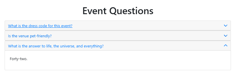
This is useful for FAQs, event schedules, or any content you want to keep organized and easy to navigate.
Adding the Expandable Block
Drag and drop More Column Content from the Website Editor Sidebar into the column space where you want to add the Expandable Block element.
This will open the Choose Content window. Select the Basic Content tab and click Expandable Block to drop it into the column space you selected.
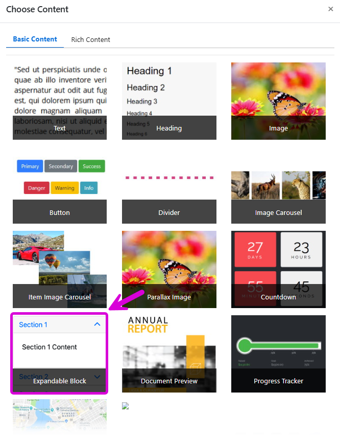
The empty element will appear on the page.

Editing the Expandable Block
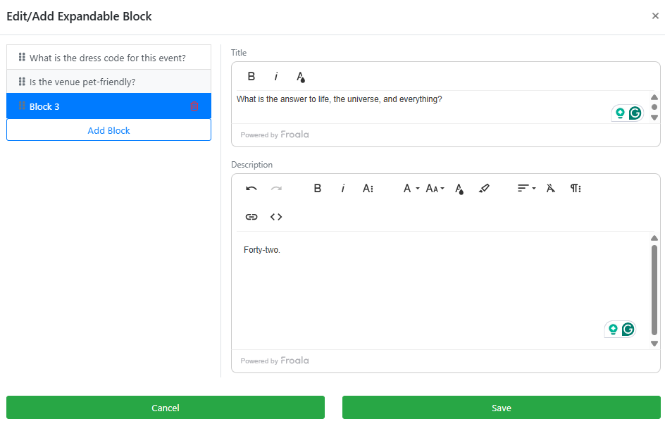
To open the Edit/Add Expandable Block window, double-click the element on the page or click the Add blocks button.
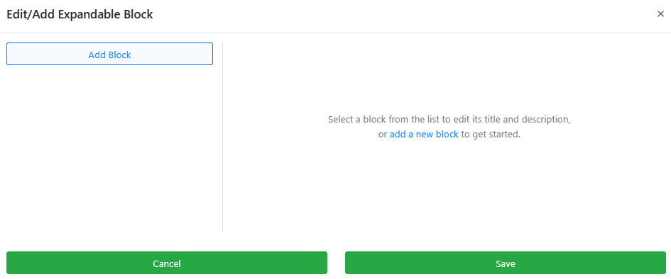
Click Add Block to add your first block. Enter your preferred content in the Title and Description fields. Both fields support text formatting, including bold, italic, and font color changes.
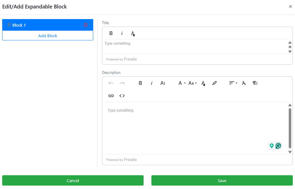
To add another block, click Add Block again. The new block will appear beneath the previous one. Continue adding blocks as needed, then click Save when you are done.
Styling and Visibility
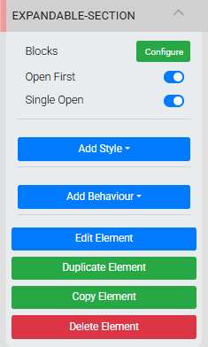
When the element is selected, the Website Editor Sidebar also displays two toggle options for controlling how the accordion behaves when guests view the page:
| Toggle | Description |
|---|---|
| Open First | When enabled, the first block is open by default when the page loads. |
| Single Open | When enabled, only one block can be open at a time — opening a new block automatically closes the previously open one. |
Like other website elements, you can apply styling, set visibility behavior, and duplicate, copy, or delete the Expandable Block element from the options in the Website Editor Sidebar.
Tips
See Common Element Actions for more details on managing your event website's elements.
Last reviewed: July 2026