
Learn about the components of the Website Editor Sidebar.
After opening the Website Editor, the Website Editor Sidebar appears on the left side of the page.
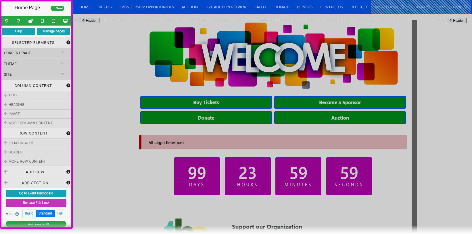
The Website Editor sidebar appears on the left side of your event website.
Sidebar Components
The sidebar opens displaying the current page title at the top, followed by editor controls and preview icons.
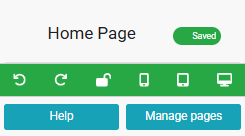
The editor sidebar has a series of editing controls at the top.
Editor Controls
| Control | Description |
|---|---|
| Undo | Reverses the most recent change made to the page. |
| Redo | Reapplies a change that was previously undone. |
| Release Edit Lock | Exits edit mode in the current browser tab and releases the website lock so other users can begin editing. See Website Locked for more details. |
Preview Icons
The preview icons let you view your site at different screen sizes: current browser, mobile, tablet, and desktop. See Preview Website Pages for more information.
Help
Clicking the Help button opens a video showcase with tutorials about the Website Editor, as well as a link back to the User Guide.
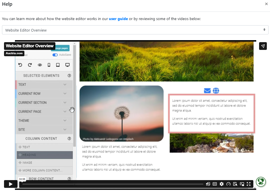
An example from a demonstration event.
Manage Pages
Clicking the Manage Pages button opens the Website Pages window, where you can add, reorder, rename, and delete pages on your event website.
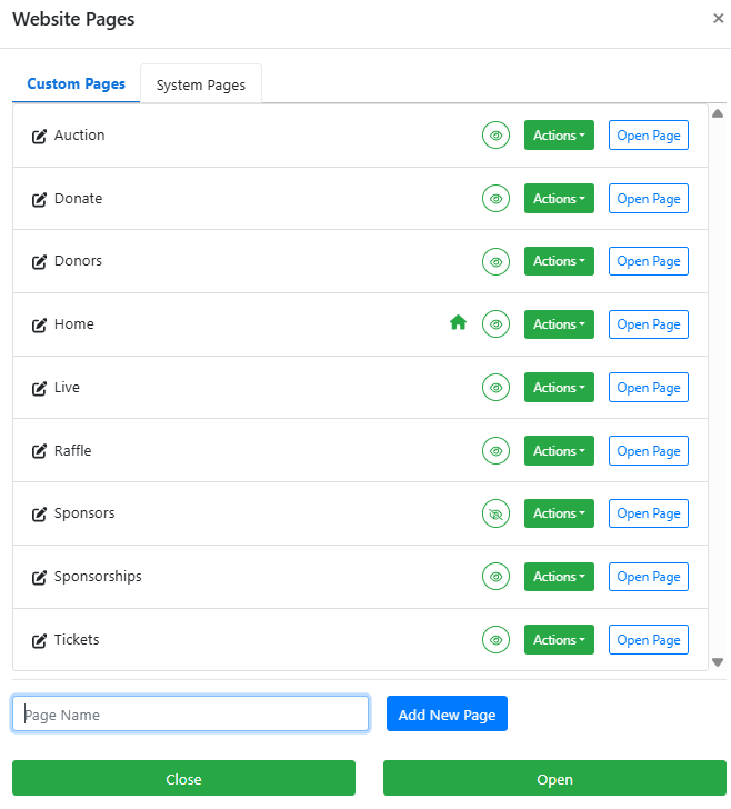
An example from a demonstration event.
See Manage Pages for more information.
Selected Elements
The Selected Elements section of the sidebar updates dynamically to show the editing controls for whatever section or element is currently selected on the page.
This is also where you will find the Current Page Settings, Website Theme Settings, and Site Settings options.
Column Content
The blocks in the Column Content section can be dragged into a row's content container on the page.
See Column Content for more information on the available column content elements.
Row Content
The blocks in the Row Content section can be dragged onto the page to add a new row of predefined content.
See Row Content for more information on the available row content elements.
Add Row
Drag a Row placeholder onto the page to create an empty row. A pop-up will appear asking you to select the number of columns for the row.
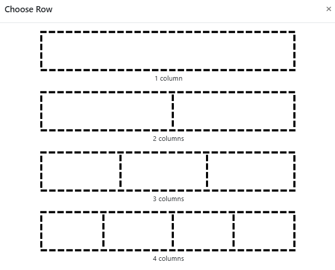
An example from a demonstration event.
Cancelling the add row operation
Closing the Choose Row window (clicking the x in the top-right corner) without selecting a column layout will cancel the add row operation.
See Adding A Row for more information.
Add Section
Drag a Section placeholder onto the page to add a new section. Like adding a row, the Choose Rows pop-up will appear to set the initial column layout. Sections can contain multiple rows and are useful for separating distinct areas on a page. Once a section has been added, you can use Add Row to add more rows within it.
See Adding A Section for more information.
Go to Event Dashboard
Click Go to Event Dashboard at the bottom of the sidebar to return to your event dashboard.
Release Edit Lock
Click Release Edit Lock to exit edit mode in the current browser tab. This also releases the website lock so other users can begin editing.

An example from a demonstration event.
See Website Locked for more details on how website locking works.
Website Editor Mode
The Website Editor has three distinct modes that affect which features are available when editing.

An example from a demonstration event.
See Website Editor Mode Effects for more details.