
Learn how to add and configure a Divider element on your event website.
The Divider element adds a horizontal rule to a column, useful for separating sections of content visually. When first added, it displays a solid black line at full width.

An example of the Divider element on an event website in Edit mode.
Adding a Divider to a page
Drag the Divider element from the Website Editor Sidebar into a column space.
Divider Settings
Clicking a Divider element opens the Divider settings panel in the Website Editor Sidebar.
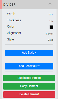
The Divider settings panel in the Editor sidebar.
| Setting | Description |
|---|---|
| Width | Sets the length of the divider. Select a unit of measure from the drop-down beside the value field. Default is 100%. |
| Thickness | Sets the height of the divider line. Select a unit of measure from the drop-down beside the value field. Default is 1px. |
| Color | Sets the line color using a Color Picker. Default is #000000 (black). |
| Alignment | Sets the horizontal alignment of the divider within its column. Only applies when Width is less than the full column width. Default is Center. |
| Style | Sets the line style. Options are Solid (default), Dashed, and Dotted. |
Divider Style vs. Add Style
The Style setting here controls the line appearance of the divider itself and is separate from the Add Style general element option.
See Common Element Actions for more details on managing the Divider element.