
Learn about the styling options available for elements, rows, and sections in the Website Editor.
Clicking Add Style on a selected element, row, or section opens the styling options available for that item. Not all properties are available for every element — what appears depends on the element type.
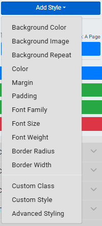
An example of the Add Style options for an element.
Background
Controls the element's background color, image, and image repeat behavior. See Background for full details.
Buttons
Available on the Item Catalog and Donor Catalog elements. Controls the appearance of catalog action buttons.
| Property | Description |
|---|---|
| Button Background | Background color of the button in its default state. |
| Button Background on Hover | Background color when a guest hovers over the button. |
| Button Color | Text color of the button label in its default state. |
| Button Color on Hover | Text color when a guest hovers over the button. |
See Change Catalog Button Colors for more details.
Fonts
Controls text color, size, font family, weight, and line height. See Fonts for full details.
Height
Controls the height, minimum height, and maximum height of the element. See Height for full details.
Links
Available on navigation elements such as the menu and header. Controls the color of links when hovered.
| Property | Description |
|---|---|
| Link Color on Hover | Text color when a guest hovers over a link. |
| Link Background Color on Hover | Background color behind the link text when hovered. |
Margin and Padding
Controls the spacing inside and around the element.
| Property | Description |
|---|---|
| Margin | Space outside the element's border, between it and surrounding content. Can be set for each side independently. |
| Padding | Space inside the element's border, between the border and the content within. Can be set for each side independently. |
Text Align
Sets the horizontal alignment of text within the element.
| Option | Description |
|---|---|
| Left | Aligns text to the left edge. Default for most elements. |
| Center | Centers text horizontally. |
| Right | Aligns text to the right edge. |
Border
Controls the border drawn around the element.
| Property | Description |
|---|---|
| Border Width | Thickness of the border. |
| Border Style | Visual style of the border — Solid, Dashed, Dotted, or None. |
| Border Color | Color of the border. |
| Border Radius | Rounds the corners of the element. |
Thermometer
Available on the Progress Tracker element. Controls the colors of the progress thermometer.
| Property | Description |
|---|---|
| Thermometer Color | Fill color of the thermometer bar. |
| Thermometer Border Color | Color of the thermometer's border. |
| Thermometer Background Color | Background color behind the thermometer bar. |
Custom Style
The Custom Style option provides an input field for entering individual CSS property-value pairs. Use this to apply styles not covered by the options above.
Advanced Styling
For more complex customization, Advanced Styling lets you write and apply custom CSS directly to the element. See Introduction To Advanced Styling for details.