
Learn about the common set of actions available for managing elements, rows, and sections on your event website.
Most elements in the Website Editor share a common set of actions for styling, editing, copying, and deleting. These actions are available in the settings panel, which appears in the sidebar whenever an element is selected.
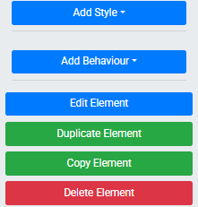
An example of the action buttons that appear on a selected element's settings panel.
Add Style
The Add Style button opens a set of styling options for the selected element, including colors, fonts, spacing, borders, and more. See Add Style for full details.
Add Behavior
The Add Behavior button opens options for assigning interactive behaviors to an element, such as click actions and visibility rules. See Add Behavior for full details.
Edit Element
The Edit Element button opens an editing interface specific to that element — for example, clicking it on an Image element opens the Choose Image window.
Copy Element
The Copy Element button creates an exact copy of the selected element. A temporary notification confirms the copy was made, and a button for the copied element appears in the sidebar. Drag it to any column space on the current page or a different page to place the copy.
Copy Row
The Copy Row button works the same way for an entire row. Select the row and click Copy Row — a temporary button appears in the sidebar that you can drag to any section on the current or a different page.
Copy Section
The Copy Section button works the same way for an entire section. Select the section and click Copy Section — a temporary button appears in the sidebar that you can drag to any page.
Duplicate Element
The Duplicate Element button immediately creates a copy of the selected element and places it directly below the original within the same content space. Unlike Copy Element, no dragging is required — the duplicate appears in place.
Delete Element
The Delete Element button removes the selected element after displaying a confirmation window. Click Yes to confirm the deletion.
Trashcan icon skips confirmation
Deleting an element using the trashcan icon (visible when hovering over an element) removes it immediately without a confirmation step.