
The main auction catalog element used to display items available at your event.
The Item Catalog row element displays your event items on the website. By default it shows all items, but it can be configured to display specific item types or categories.
See Configure Items Displayed for details on controlling which items appear.
By default, the Item Catalog includes:
- A Search field for guests to find items by keyword.
- A Show Me drop-down to filter items by group or category.
- Page navigation bars to move through the catalog across multiple pages.
- Item cards displaying the configured items.
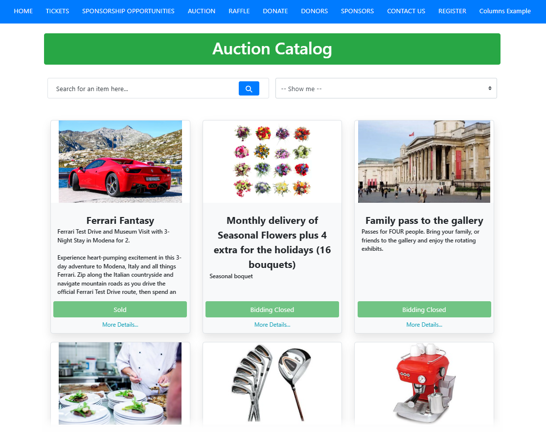
An example Item Catalog on an event website.
Adding the Item Catalog to a page
Drag the Item Catalog element from the Website Editor Sidebar into a row on the page. To browse all row content options first, drag More Row Content onto the page to open the Choose Row window.
Selecting the Item Catalog element opens the Catalog settings panel in the Editor sidebar.
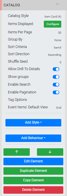
The Catalog settings in the Website Editor sidebar.
Catalog Style
The Catalog Style setting controls the layout and appearance of item cards in the catalog. This is one of the most commonly customized aspects of the Item Catalog, as it affects every item card being displayed.
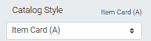
An example from a demonstration event.
See Configure Item Catalog Style for details on the available styles and their properties.
Items Displayed
Clicking Configure for the Items Displayed setting opens the Select Items window, where you define which items appear in the catalog.
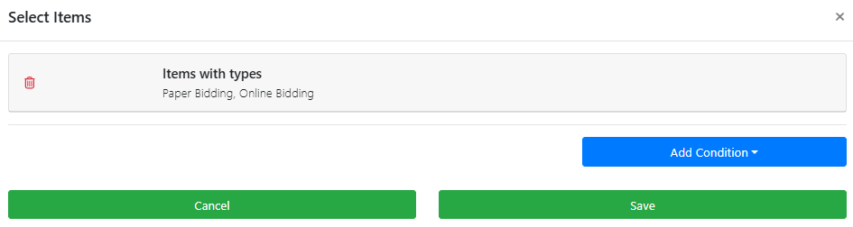
The Select Items window.
See Configure Items Displayed for full details.
Items Per Page
Sets the maximum number of item cards displayed on a single catalog page.
An example from a demonstration event.
Pagination disabled
If Enable Pagination is turned off, set Items Per Page to a value equal to or greater than the total number of items in the catalog — otherwise some items will not be displayed.
Filling rows evenly
The Items Per Page value works together with the Desktop Card Columns setting in the Item Card panel. Setting Items Per Page to a multiple of the column count (for example, 6, 9, or 12 items with 3 across) helps keep rows filled evenly.
Group By
By default, no grouping is applied to the catalog. Changing Group By from its default of None lets you group items by Category, Event Start Time, or Event Location.
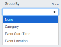
An example from a demonstration event.
Items within each group follow the catalog's Sort Criteria setting.
Sort Criteria
Sets the order in which items are displayed in the catalog. The default is Item#.

An example from a demonstration event.
| Option | Description |
|---|---|
| Item# | Sorts items by item number. Default. |
| Title | Sorts items alphabetically by title. |
| Value | Sorts by the value set in the Item Details Summary tab. |
| Starting Bid | Sorts by the item's starting bid amount. |
| Bid Increment | Sorts by the item's bid increment amount. |
| Buy It Now Price | Sorts by the item's Buy It Now price. |
| Event Item's Start Time | Sorts by the scheduled start time of the event item. |
| Created At | Sorts by the date and time each item was created. |
| Modified At | Sorts by the date and time each item was last modified. |
| Reference | Sorts by the Reference field in the Item Details Summary tab. |
| Location | Sorts by the Location field in the Item Details Summary tab. |
Tie-breaking
If the selected sort criteria has duplicate or empty values (such as Location), items fall back to sorting by Item# as a secondary criterion.
Sort Direction
Sets whether items are sorted Ascending (lowest to highest, default) or Descending (highest to lowest).

An example from a demonstration event.
Shuffle Seed
Controls whether items are shuffled after sorting, and how that shuffle behaves.
An example from a demonstration event.
| Value | Behavior |
|---|---|
| 0 (default) | No shuffle. Items appear in the sort order defined by Sort Criteria and Sort Direction. |
| Positive number | Items are shuffled into a consistent order. The same layout appears on every page load. |
| Negative number | Items are reshuffled on every page load, so the order changes with each visit. |
Shuffle applies per page with pagination
The catalog sorts items first using Sort Criteria and Sort Direction, then applies the shuffle to those results. If Enable Pagination is active, the shuffle applies per catalog page — not across the full set of items.
Allow Drill To Details
Toggles the (More Details...) link in item descriptions and the ability to click an item card to open its details page.
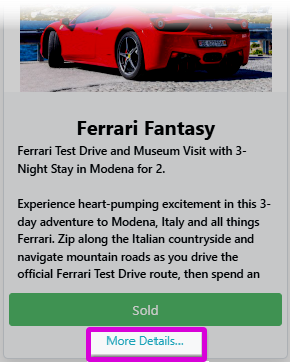
An example from a demonstration event.
Required for bidding
This option must be enabled for biddable items (Biddable Type Items) to receive bids through the auction catalog.
Show Groups
Toggles the Show Me filter drop-down. When enabled, the drop-down lists all item categories created for the event by default.
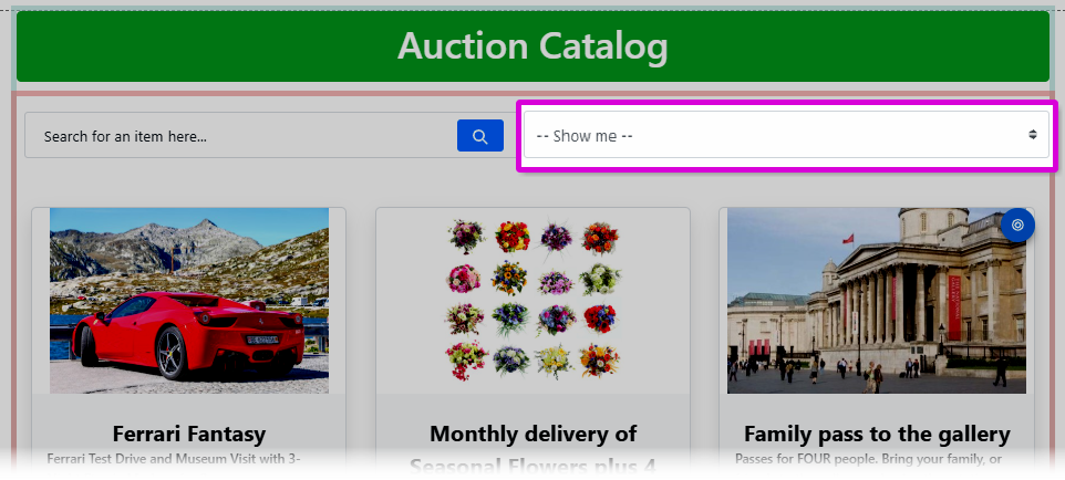
The Show Me filter bar in the Item Catalog.
If the Items Displayed condition is configured to filter by specific categories, the Show Me drop-down will only list those selected categories.
Enable Search
Toggles the Search field at the top of the Item Catalog.
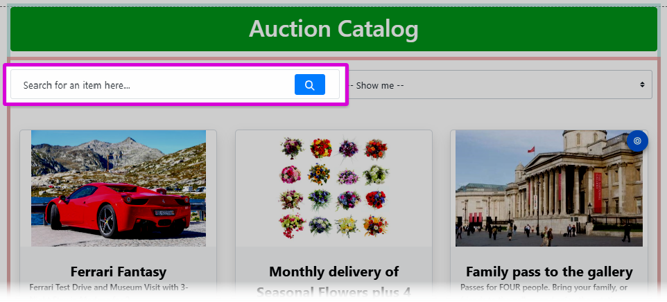
The search bar in the Item Catalog.
Enable Pagination
Toggles the page navigation bars at the top and bottom of the catalog.
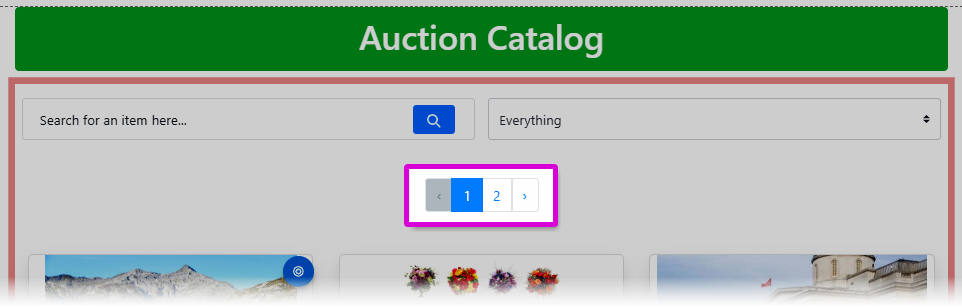
The pagination bar in the Item Catalog.
Tag Options
Allows you to define publicly visible tags in the Item Catalog. Guests can use these tags to filter the displayed items.
Tags appear as checkboxes above the catalog. A drop-down selector controls the filter logic:
- Match All — shows items that have all of the selected tags.
- Match Any — shows items that have at least one of the selected tags.
- Match None — shows items that have none of the selected tags.
Tags are manually entered
Tags are typed into the Tag Options text field and will match existing tags assigned to items, but the field does not auto-complete. Check spellings carefully.
Customizing tag display text
You can set a different display label for each tag by using the format tagValue: Display Label. For example, myTag: My Tag, tagged: Tagged, Electronics displays My Tag, Tagged, and Electronics in the catalog while filtering by the underlying tags myTag, tagged, and Electronics.
Event Items' Default View
This option is only available when the Items Displayed condition is set to Scheduled Events. It sets the initial view guests see when they arrive at the page.
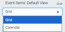
An example using the Grid default view from a demonstration event.
Guests can toggle between views at any time using the view buttons in the catalog.
Item Card
Each item card in the catalog has its own settings panel.
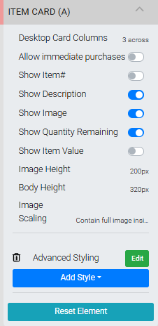
The Item Card settings panel.
To open it, hover over an item card in edit mode and click the Edit icon in the top right corner of the card.
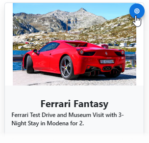
The Edit icon on an Item Card.
| Setting | Description |
|---|---|
| Desktop Card Columns | Controls how many item cards appear across a row on desktop screens. Default is 2 across. |
| Allow Immediate Purchases | Toggles whether guests can purchase For Sale items directly from the item card without opening the item details page. |
| Show Item# | Toggles the display of the item number on the card. |
| Show Description | Toggles the display of the item description on the card. |
| Show Image | Toggles the display of the item image on the card. |
| Show Quantity Remaining | Toggles the display of remaining quantity on the card. Only applies to For Sale items with the Immediate Payment Only purchase behavior. |
| Show Item Value | Toggles the display of the item value on the card. |
| Image Height | Sets the height of the item image area on the card. |
| Body Height | Sets the height of the card body below the image. |
| Image Scaling | Controls how the item image is scaled within the image area. |
Item Details
Clicking an item card in the catalog opens the Item Details element, which displays the full item information and bidding controls. See Item Details for details on configuring this component.
See Common Element Actions for more details on managing the Item Catalog element.