
Learn how to use the Donation Element to collect general donations or display donation items on your event website.
The Donation Element is a row content element that lets you collect donations on your event website without requiring Donation Items to be created in the event. By default it is configured as a simple general donation form, but it can also be switched to display existing Donation Items.
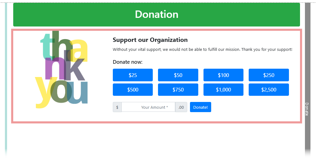
An example of the Donation Element on a page.
Add the Donation element to a page
To add the Donation Element to a page, drag it from the Website Editor Sidebar into a row, or drag More Row Content onto the page and select Donation Element from the Choose Row window.
Selecting the Donation Element on the page will open the Donation settings panel in the Editor sidebar.
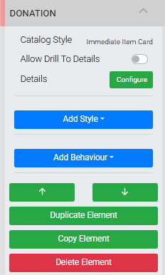
The Donation settings panel in the Website Editor sidebar.
Donation Settings
Catalog Style
The Catalog Style setting controls the card layout used to display the donation. The default is Wide Card. Available styles are Small Card, Wide Card, Image Only Card, Immediate Item Card, and Immediate Vertical Card.
Allow Drill To Details
Toggles the (More Details...) link in the item description and the ability to click the card to view full donation details. Useful when the description content doesn't fit within the initial card view.
Disable with Immediate cards
This option should be left disabled when using an Immediate Item Card or Immediate Vertical Card style.
Configure Details
Clicking the Configure button opens the Select Details dialog, where you switch between Cash Donation Mode and Donation Items Mode and configure the details of each.
Cash Donation Mode
The default mode. The Donation Element acts as an open general donation form — no Donation Items are required.
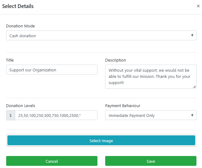
The Select Details dialog in Cash Donation mode.
If you only need a simple open-value donation form, you can proceed with the defaults as-is.
Title and Description
Basic text fields for the donation title and description. Edit these to suit your event.
Donation Levels
Creates a tiered set of giving options for donors. Leave as * (the default) to show a single Donate Now button with an open amount field. Enter a comma-separated list of specific amounts to add preset giving buttons. Combining * with specific amounts — for example *,100,200,500 — shows preset buttons alongside an open field where donors can enter their own amount.
Payment Behavior
Controls how the donation is processed after a guest selects an amount. Works the same as the Donation Items online purchase behavior.
| Option | Description |
|---|---|
| Immediate Payment Only | Takes the donor directly through checkout to complete the payment. Default. |
| Add To Account Only | Adds the donation to the donor's account for payment at a later time. |
| Account For Bidders, Otherwise Immediate | Routes logged-in bidders to Add To Account and all others to Immediate Payment. |
Select Image
Clicking Select Image opens the Choose Image interface to choose an image for the donation card.
Click Save when you are done to apply your changes.
Donation Items Mode
The alternative mode displays existing Donation Items from a drop-down selector, rather than using a general donation form.
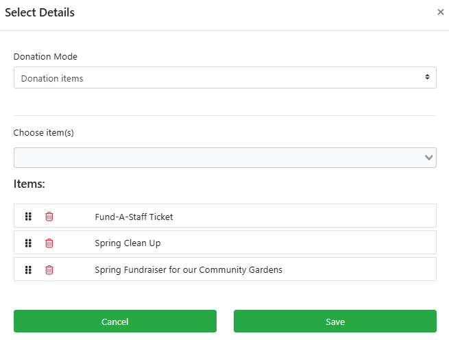
The Select Details dialog in Donation Items mode.
Clicking Choose item(s) opens a pre-populated list of your current Donation Items. Selected items are listed below the drop-down. You can drag and drop the listed items to reorder them.
Title
A text label displayed above the donation items. Default is Donation.
Description
A short description displayed below the title. Default is Thank you for your support.
Donation Levels
Sets the giving options available for each item. The default * creates a Donate Now button. You can also enter a comma-separated list of amounts, or combine * with specific amounts to show both preset buttons and an open field.
Image
Clicking Configure opens the Choose Image window to set the image displayed across all Donation Element catalog styles.
See Common Element Actions for more details on managing the Donation Element.