
Learn how pages are structured in the Website Editor and how to configure sections, rows, and columns.
Pages in the Website Editor are built from Sections, which contain one or more Rows, which in turn contain one or more Columns. As you move your mouse pointer over a page in edit mode, sections, rows, and columns are highlighted with colored borders.
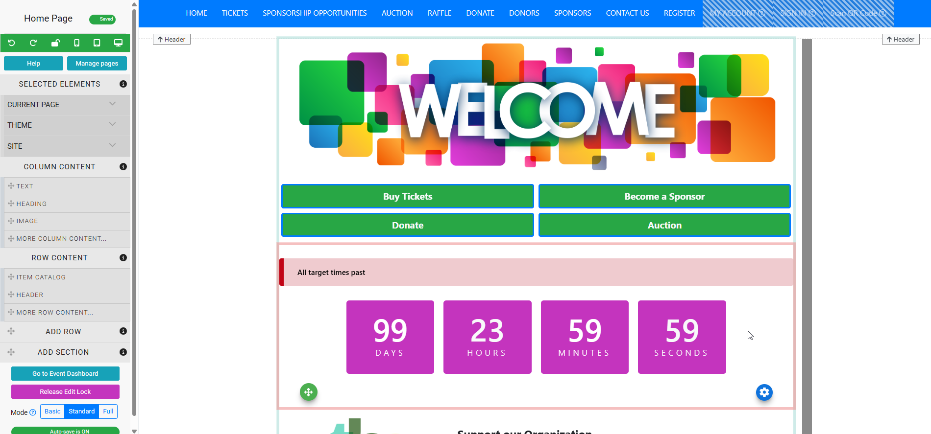
An example of an event website with the Countdown section highlighted.
Adding new sections and rows
Sections and rows are added by dragging them from the Website Editor Sidebar onto the page. See Adding Rows & Sections for details.
Sections
Each section has a green Move icon at its bottom left and a blue Edit (cog) icon at its bottom right.
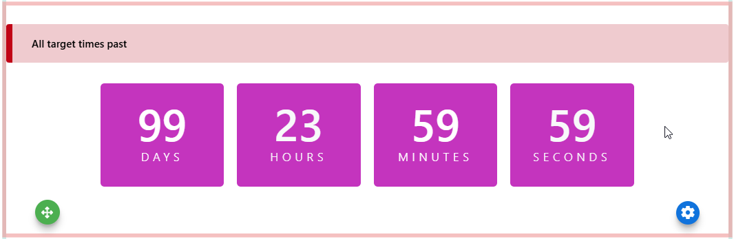
The example Countdown section selected to see the Move and Edit icons.
Clicking the Edit icon displays additional action icons and updates the Selected Elements panel in the sidebar to show the section's properties. The current section is highlighted by a green border on its left side.
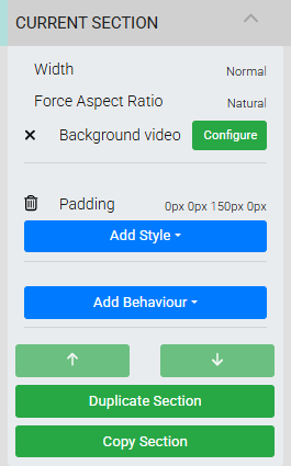
An example from a demonstration event.
Section Properties
| Property | Description |
|---|---|
| Width | Controls how wide the section extends on the page. Default is Normal. Other options are Full Width and Only Background Full Width. |
| Force Aspect Ratio | Locks the section to a fixed aspect ratio. Default is Natural. Other options are 1:1, 4:3, 16:9, and 16:10. |
| Background Video | An advanced option for adding a background video, generally used with the Hero Element. |
Section Controls
| Control | Description |
|---|---|
| Add Style | Opens the available style options for the section. See Add Style for more information. |
| Move Up / Move Down | Moves the entire section up or down on the page. |
| Duplicate Section | Creates an exact duplicate of the section and places it directly beneath. |
| Copy Section | Copies the section so it can be pasted onto another page. |
Rows
Clicking on a row highlights it and updates the Selected Elements panel to show that row's properties. The current row is highlighted by a blue border on its left side.
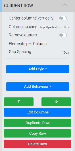
An example from a demonstration event.
Row Properties
| Property | Description |
|---|---|
| Center Columns Vertically | Toggles whether column content is centered vertically within the row. Default is off. Works best when there are multiple columns across the row. |
| Column Spacing | Adds spacing above and below the columns in the row. Default is None. Click the label to open a parameters window where you can enter values and set the unit of measure. |
| Remove Gutters | Toggles whether the gutters are removed, extending the row to the left and right edges of the browser view. Default is off. |
| Elements Per Column | Allows multiple elements in the same column to display side by side across the column width. A value of 2 or greater arranges elements horizontally, wrapping as needed. |
| Gap Spacing | Controls the spacing between individual elements when Elements Per Column is 2 or more. This is an advanced property and is generally best left at its default. |
Row Controls
| Control | Description |
|---|---|
| Add Style | Opens the available style options for the row. See Add Style for more information. |
| Add Behaviour | Opens the row's visibility settings. See Website Element Visibility for more details. |
| Move Up / Move Down | Moves the entire row up or down within the section. |
| Edit Columns | Opens the How To Edit Columns window to add, remove, or resize the columns in the row. |
| Duplicate Row | Creates an exact duplicate of the row and places it directly beneath. See Duplicate Element for more information. |
| Copy Row | Copies the row so it can be pasted onto another page. See Copy Row for more information. |
| Delete Row | Removes the row. See Delete Element for more information. |
Columns
Each row contains one or more columns, which hold the content elements displayed on the page. The currently selected content block is highlighted with a pink border.
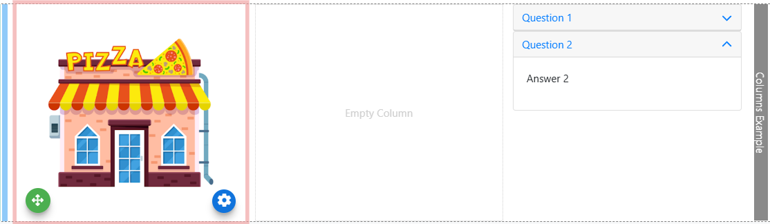
An example of a row with multile columns and one element highlighted.
Tip
In general, double-clicking an element in edit mode selects it and shows its settings in the Selected Elements panel.
See How To Edit Columns for details on adding, resizing, reordering, and removing columns.