
Configure the style and display of the Item Catalog on your event website.
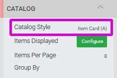
The Catalog settings panel in the Editor sidebar with the Catalog Style setting highlighted.
The Catalog Style setting determines which Item Card template is used to display items in the Item Catalog. Each card style has its own set of configuration options that open in the Editor sidebar — settings from one card style do not carry over to another.
Show Quantity Remaining
The Show Quantity Remaining option only applies to For Sale Items with the Immediate Payment Only purchase behavior selected.
Item Card (A)
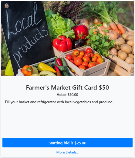
An example of Item Card A from a demonstration event.
Replaces the legacy Small Item Card style.
| Option | Description |
|---|---|
| Desktop Card Columns | Number of cards per row on desktop. Options: 2, 3, 4, or 6 across. Default: 2 across. Mobile views display one card per row. |
| Allow immediate purchases | Enables immediate purchase for For Sale Items only. |
| Show Item# | Displays the item number to the right of the item title. |
| Show Description | Toggles display of the item description on the card. |
| Show Image | Toggles display of the item image on the card. |
| Show Quantity Remaining | Displays available quantity when set greater than 1. |
| Show Item Value | Toggles display of the item value. |
| Image Height | Sets a maximum height for the card image. Default: 300px. |
| Body Height | Sets the height of the card body. Default: 320px. |
| Image Scaling | Crops the image to fill the image space, or displays the full image within it. |
Item Card (B)
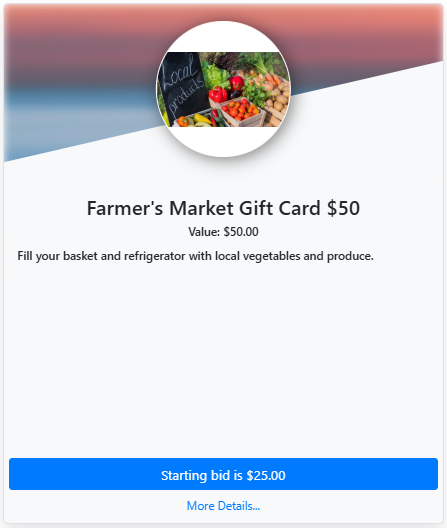
An example of Item Card B from a demonstration event.
| Option | Description |
|---|---|
| Desktop Card Columns | Number of cards per row on desktop. Options: 2, 3, 4, or 6 across. Default: 2 across. Mobile views display one card per row. |
| Allow immediate purchases | Enables immediate purchase for For Sale Items only. |
| Show Item# | Displays the item number to the right of the item title. |
| Show Description | Toggles display of the item description on the card. |
| Show Quantity Remaining | Displays available quantity when set greater than 1. |
| Show Item Value | Toggles display of the item value. |
| Background Image Source | Choose between Custom image (a manually set image) or Item image (the item's own image). Default: Custom image. |
| Background Image | Sets the custom background image. Only applies when Background Image Source is set to Custom image. |
| Background Image Blur | Blur amount applied to the background image. Default: 5px. |
| Background Image Scaling | Scales the background image within the card. Default: 200%. |
| Background Image Opacity | Transparency of the background image. Default: 0.8. |
| Body Height | Sets the height of the card body. Default: 320px. |
Item Card (C)
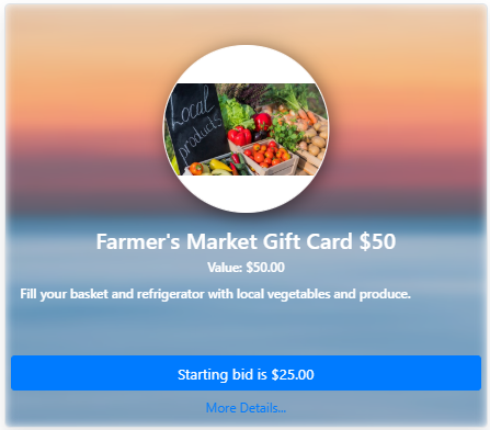
An example of Item Card C from a demonstration event.
| Option | Description |
|---|---|
| Desktop Card Columns | Number of cards per row on desktop. Options: 2, 3, 4, or 6 across. Default: 2 across. Mobile views display one card per row. |
| Allow immediate purchases | Enables immediate purchase for For Sale Items only. |
| Show Item# | Displays the item number to the right of the item title. |
| Show Description | Toggles display of the item description on the card. |
| Show Quantity Remaining | Displays available quantity when set greater than 1. |
| Show Item Value | Toggles display of the item value. |
| Background Image Source | Choose between Custom image (a manually set image) or Item image (the item's own image). Default: Custom image. |
| Background Image | Sets the custom background image. Only applies when Background Image Source is set to Custom image. |
| Background Image Blur | Blur amount applied to the background image. Default: 5px. |
| Background Image Scaling | Scales the background image within the card. Default: 200%. |
| Background Image Opacity | Transparency of the background image. Default: 0.8. |
| Card Height | Sets the overall height of the card. Default: 460px. |
Image Only Item Card
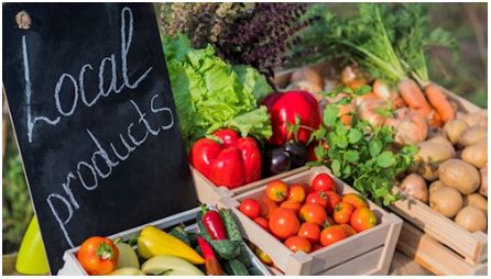
An example of the Image Only Item Card from a demonstration event.
| Option | Description |
|---|---|
| Desktop Card Columns | Number of cards per row on desktop. Options: 2, 3, 4, or 6 across. Default: 2 across. Mobile views display one card per row. |
| Image Height | Sets a maximum height for the card image. Default: 300px. |
| Image Scaling | Crops the image to fill the image space, or displays the full image within it. |
| Click to buy/donate | Allows an immediate transaction for For Sale or Donation items only. |
Full Item Card (A)
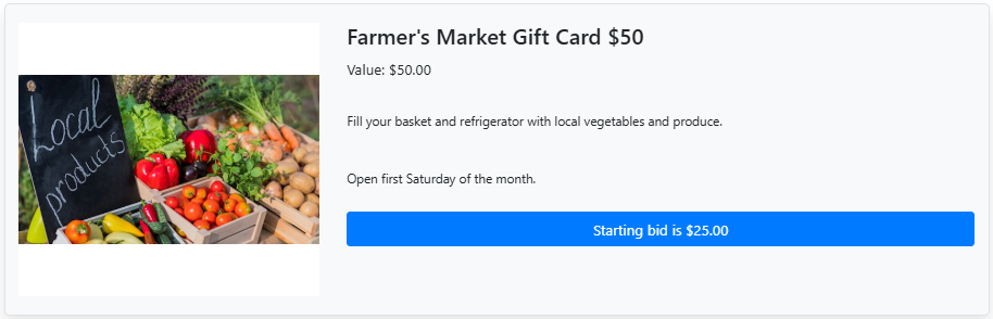
An example of the Full Item Card (A) from a demonstration event.
Replaces the legacy Wide Item Card style.
| Option | Description |
|---|---|
| Allow immediate purchases | Enables immediate purchase for For Sale Items only. |
| Show Item# | Displays the item number to the right of the item title. |
| Show Description | Toggles display of the item description on the card. |
| Show Image | Toggles display of the item image on the card. |
| Show Quantity Remaining | Displays available quantity when set greater than 1. |
| Show Item Value | Toggles display of the item value. |
| Show Card Border | Toggles a border around the item card, providing a visible background for the card content. |
| Image Height | Sets a maximum height for the card image. Default: 300px. |
| Image Scaling | Crops the image to fill the image space, or displays the full image within it. |
| Background Image Source | Choose between Custom image, Item image, or No image. Default: No image. |
| Background Image | Sets the custom background image. Only applies when Background Image Source is set to Custom image. |
| Background Image Blur | Blur amount applied to the background image. Default: 5px. |
| Background Image Scaling | Scales the background image within the card. Default: 200%. |
| Background Image Opacity | Transparency of the background image. Default: 0.8. |
Full Item Card (B)
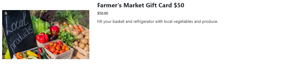
An example of the Full Item Card (B) from a demonstration event.
| Option | Description |
|---|---|
| Desktop Card Columns | Number of cards per row on desktop. Options: 2, 3, 4, or 6 across. Default: 2 across. Mobile views display one card per row. |
| Show Image | Toggles display of the item image on the card. |
| Show Description | Toggles display of the item description on the card. |
| Show Quantity Remaining | Displays available quantity when set greater than 1. |
| Item Height | Sets the height of the item card. Default: 300px. |
| Item Scaling | Crops the image to fill the image space, or displays the full image within it. |
| Checkout immediately | Allows guests to check out immediately for eligible items. |