
Learn how to add pre-built profile card layouts to your event website using the Profile Cards element.
Profile Cards are pre-built layout blocks that combine a headshot image, a title, a biography, and social media links into a single styled card. They fill the full width of the column they are placed in and are ideal for showcasing fundraising team members or highlighting event donors and sponsors.
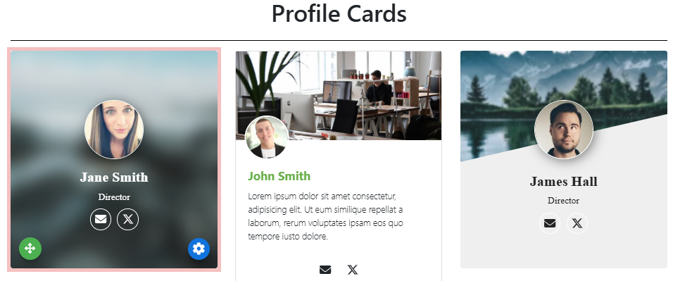
An example of a 3-column layout with all styles of Profile Card elements on the event website in Edit mode.
Adding Profile Cards to a page
Drag the More Column Content element from the Website Editor Sidebar into a column space to open the Choose Content window. Select the Rich Content tab, then click the Profile Card style you want to use.
Editing Profile Cards
Each element within a Profile Card can be edited by double-clicking it.
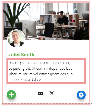
An example from a demonstration event.
| Component | How to edit |
|---|---|
| Head Shot | Double-clicking the headshot image opens the Choose Image window to replace it. |
| Title | Double-clicking the title opens a text field for editing. The title is a Heading element and can be further adjusted from the Website Editor Sidebar once selected. |
| Biography | Double-clicking the biography text opens the Edit Content window. The biography is a Text Element element and can be further adjusted from the Website Editor Sidebar once selected. |
Several style variants are available when adding Profile Cards. Each variant arranges the headshot, title, and biography differently to suit different layout needs.
See Common Element Actions for more details on managing Profile Cards.