
Learn how to display your event's sponsors in a catalog format using the Sponsors Catalog row element.
The Sponsors Catalog displays your event's sponsors in a browsable catalog layout. It is similar to the Sponsors Row but offers more layout and grouping options. By default it is configured to show all sponsorships.
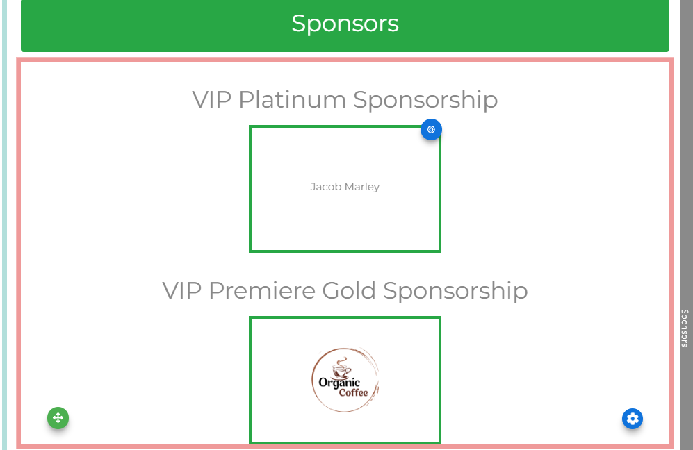
An example of the Sponsors Catalog on the event website in Edit mode.
Adding the Sponsors Catalog to a page
Drag the Sponsors Catalog element from the Website Editor Sidebar into a row, or drag More Row Content onto the page and select Sponsors Catalog from the Choose Row window.
The Sponsors Catalog consists of three components: the Sponsor Display (overall catalog settings), the Sponsorship Card (styling per sponsorship tier), and the Donor Card (individual sponsor appearance).
Sponsor Display
Selecting the Sponsors Catalog element opens the Sponsor Display panel in the Editor sidebar.
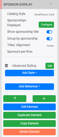
The Sponsor Display settings in the Editor sidebar.
The Sponsor Display controls the overall catalog layout and which sponsors appear.
Catalog Style
Sets the card layout style used for the sponsor cards. Select from Small or Wide options in the drop-down.
Sponsorships Displayed
Clicking Configure opens the Select Sponsorships window, where you set conditions to filter which sponsors appear.
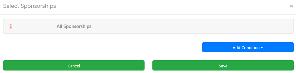
An example from a demonstration event.
Conditions can be combined and some have additional properties that open when selected.
Show Sponsorship Title
Toggles the display of the sponsorship tier name above each group of sponsors.
Group by Sponsorship
Adjusts the display to fill the content container with sponsor cards and hides the sponsorship tier title regardless of the Show Sponsorship Title setting.
Titles' Alignment
Sets the alignment of the sponsorship tier name over its respective grouping.
Sponsors per Row
Sets the number of sponsor logos displayed per row within each grouping. You can use a comma-separated list to set different counts per row — for example, 2,3,4 displays two sponsors on the first row, three on the second, and four on each subsequent row. The maximum value is 4.
Sponsor logo alignment
Sponsor logos are always centered across each row. If there are not enough sponsors to fill a row, logos are still sized as if the row were full — this maintains a consistent hierarchical appearance regardless of sponsor count.
Sponsorship Card
Clicking a sponsorship tier title selects the Sponsorship Card element, which controls the relative styling for that tier within the catalog.
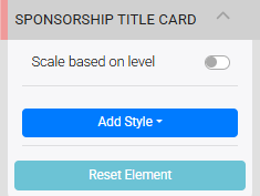
The Sponsorship Title Card settings in the Editor sidebar.
- Scale based on level — adjusts tier title sizes relative to one another, reflecting the sponsorship hierarchy.
- Add Style — opens advanced styling options for the sponsorship card.
- Reset Element — reverts all changes to this element and restores its default settings.
Donor Card
Clicking an individual sponsor (or the blue target icon visible when hovering over a sponsor) selects the Donor Card element, which controls how each sponsor logo and name appears.
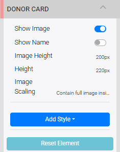
The Donor Card settings panel in the Editor sidebar.
Editing affects all donor cards
Changes made to the Donor Card settings apply to every sponsor card in the element, not just the one selected.
| Setting | Description |
|---|---|
| Show Image | Toggles the display of the sponsor's logo or image. |
| Show Name | Toggles the display of the sponsor's name. If a Company name is set on the sponsor record, it will be used instead of the bidder name fields. |
| Image Height | Sets the height of the image container. Requires a unit of measure. |
| Image Scaling | Controls how the image is scaled within the container. Options are Contain full image inside (default) and Enlarge image to cover. |
See Common Element Actions for more details on managing the Sponsors Catalog.