
Learn how to add and configure a Button element on your event website.
The Button element adds a clickable button to a column. Use it to link guests to pages, external sites, or other actions on your event website.
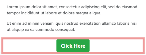
An example of a Button element on an event website in Edit mode.
Adding a Button to a page
Drag the Button element from the Website Editor Sidebar into a column space.
Making the button clickable
Buttons are not linked by default. Use the Add Behavior settings to assign a click action. See Add Button Linked To A Page for a step-by-step example.
Button Settings
Clicking a Button element opens the Button settings panel in the Website Editor Sidebar.
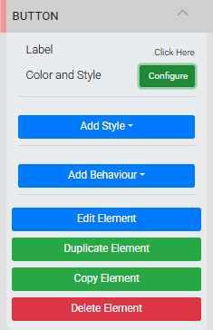
The Button settings panel in the Editor sidebar.
Label is the text that appears on the button face. Click the Label property to open its text field for editing, then click it again to close. Changes are saved automatically. Click the × beside the Label property to clear the text.
Style Configuration
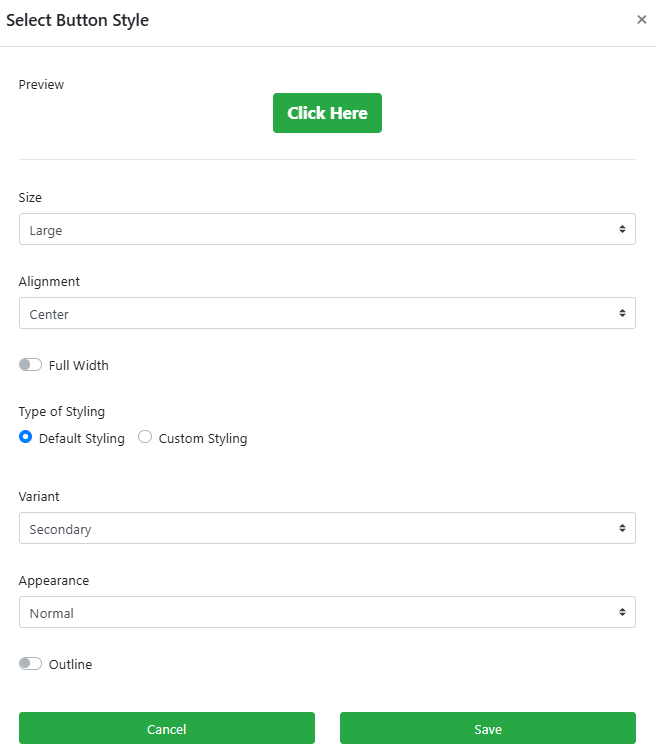
Clicking Configure opens the Select Button Style window, where you can adjust the button's appearance and preview changes in real time.
An example from a demonstration event.
Layout
| Setting | Description |
|---|---|
| Size | Sets the overall button size. Options are Small, Medium, and Large (default). |
| Alignment | Sets the horizontal alignment of the button. Options are Center (default), Left, and Right. |
| Full Width | Expands the button to fill the full width of its container. When enabled, the Alignment setting has no effect. Default is disabled. |
Default Styling
Default Styling uses colors from the current site theme palette.
| Setting | Description |
|---|---|
| Variant | Selects the theme color applied to the button. Default is Secondary. |
| Appearance | Sets the button shape. Normal (default) is a standard rounded button. Link renders the button as plain text with no background. Pill applies fully rounded ends. Squared renders the button as a rectangular block. |
| Outline | Swaps the button fill and text colors, displaying the button as an outline instead of a filled shape. |
Appearance affects available options
Some Appearance options limit other style settings. For example, selecting Link disables the Outline property.
Custom Styling
Selecting Custom Styling switches to a set of Color Picker panels that let you set the button's colors independently from the site theme.
Custom Styling uses Normal appearance only
Custom Styling always uses the Normal button shape. Default and Custom styling are independent — switching between them resets to each style's own settings.
See Common Element Actions and Add Behavior for more details on managing the Button element.